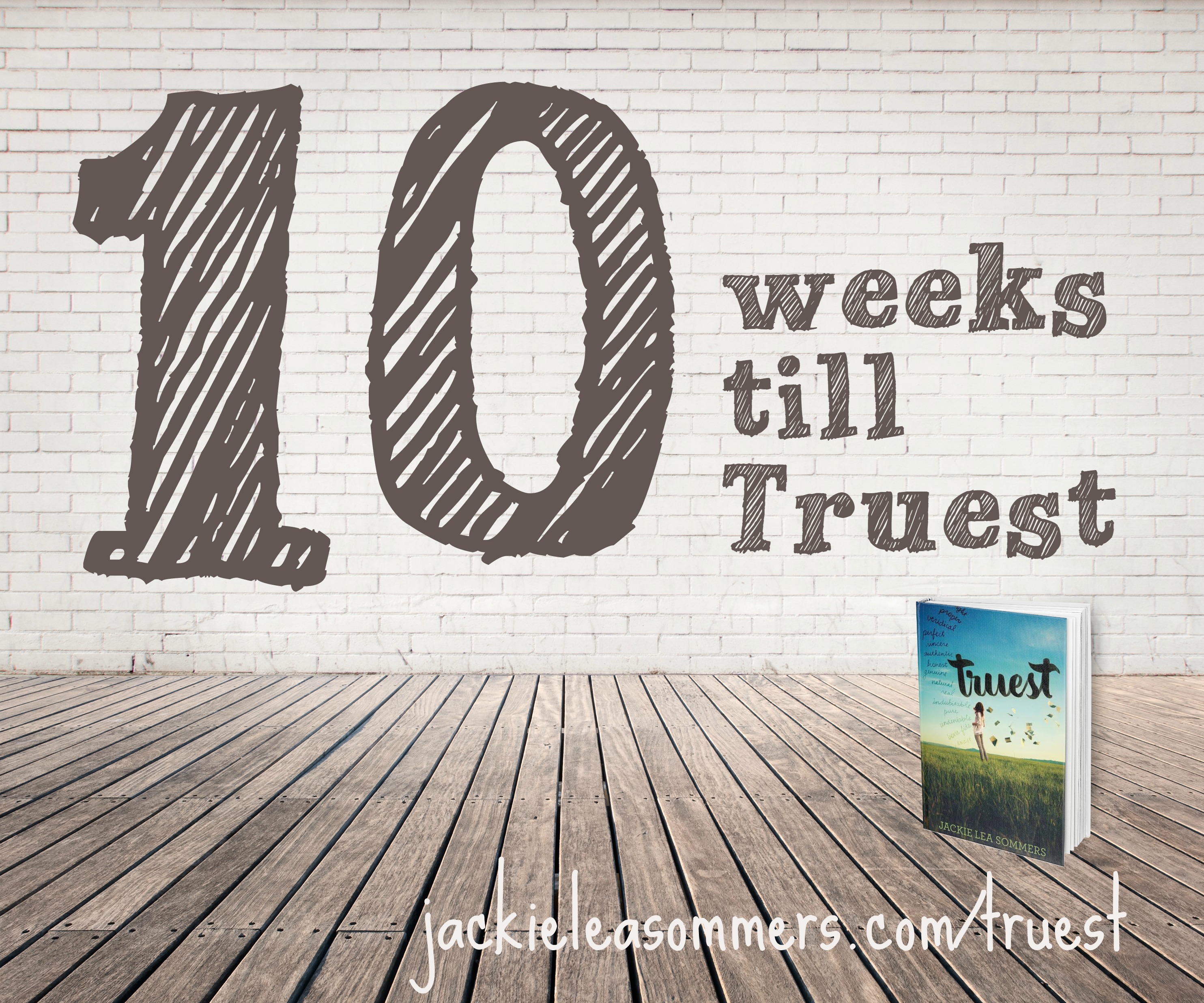
Join me in counting down the final weeks till Truest’s publication! Every Tuesday, I’ll be posting something Truest-related. Please feel free to re-blog, pin, tweet, share on Facebook, etc.– I’d love to get the word out! And, of course, you can pre-order your own copy here!
Today I’m excited to share with you how Truest‘s book cover came to be. (And please excuse the weird formatting toward the end– once I started inserting pictures, it all went haywire!)
At the end of April 2014, Laurel, an editor at Katherine Tegen Books, sent me this email:
While Jill is still working on gathering notes for you on the latest revision, I have another exciting step in the publication process. We get to start thinking about your cover! Jill and I will fill out a form to share with our designers—who work serious magic and make the best looking books in the industry—but we want your thoughts, too. What sort of design or image do you picture for your cover? Photographic or iconic? Is there anything you absolutely don’t want? Are there other books whose covers you admire? As much info you can give us will help us—and the designers—create the perfect look for TRUEST.
Please feel free to take a few days or even a couple weeks to think about this if you need to and let me know if you have any questions. This is one of my favorite parts of the process so I’m excited to get started!
“Feel free to take a couple of weeks”? The next day, I emailed her:
I’m absolutely no designer, but here are my thoughts (in my non-designer language):
My DREAM cover:
Silas and West, sitting in a lifeguard stand, looking out at the swans on Green Lake
An image like this:
I really like the idea of a photographic cover, but I prefer to not see the actual faces (I think it’s better for the reader to imagine the characters than to be shown their faces). I feel like Truest’s cover should have an element of seriousness/depth. I see a lot of books with just a girl on the front, but I’d hope Silas would be there too.
I dislike overly girly covers, covers that make it look like the book is ONLY a romance, covers boys would be embarrassed to be holding, covers that insinuate the book is the literary equivalent of a rom com.
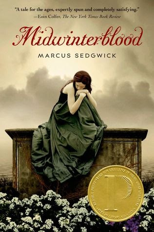
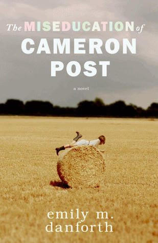
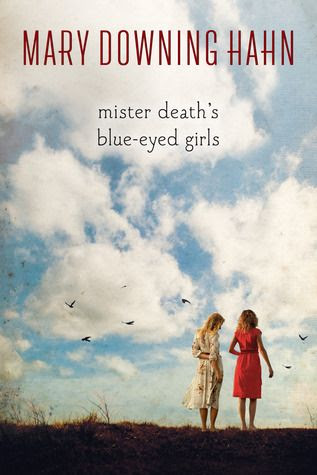
I also sent along some images of covers I love (most with a darker theme):
And a couple illustrated covers I love too:
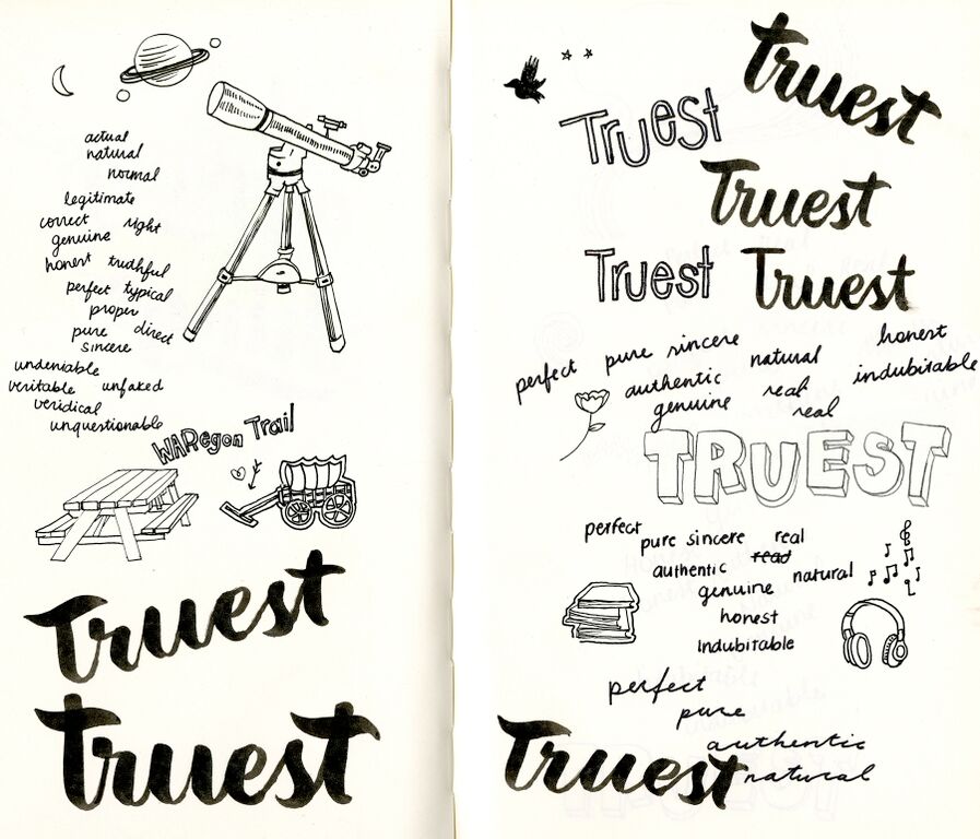
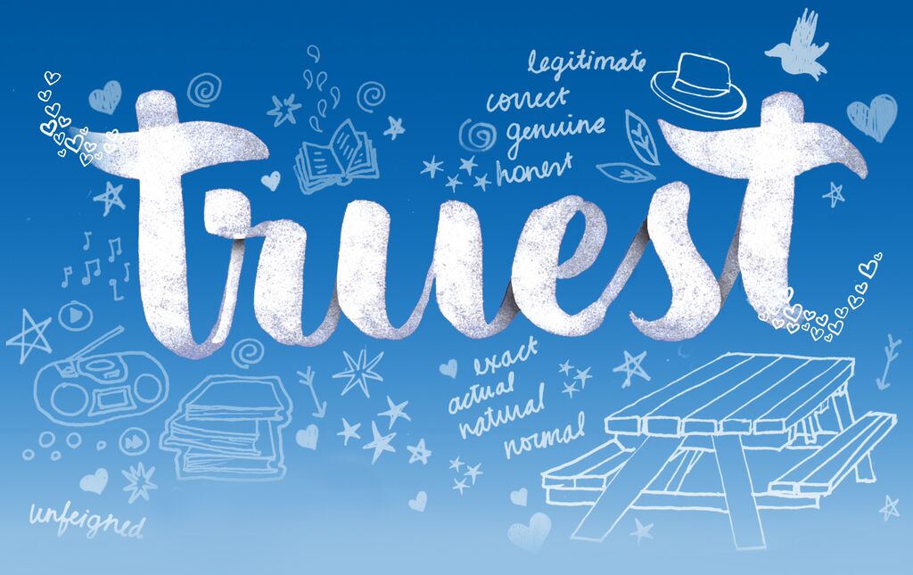
In August 2014, my editor teased me a little, emailing, “The way they painted the word TRUEST is stunning.” Of course, I begged to see! There were eight options. Half of them had swans on the cover (if you read the book, you’ll understand why). One had teens in a car. One had a girl, reading in a road. Nearly all of them had Jenna’s beautiful hand-lettered title as we recognize it today, though sometimes it looked a little different!

Don’t you love the little tail of hearts??
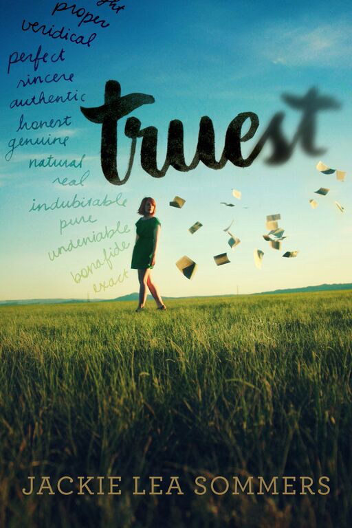
One had a girl in it, standing on grass, with book pages blowing in the wind around her.
This is going to look familiar, but look twice.

The original of this also had the column of words in dark, bold black.
I loved this design, but I mentioned again how I’d prefer not to have a face on the cover, how West has long hair and is rarely seen wearing a dress. We also had a discussion about whether or not to blur out the end of the title– it references how West often describes herself as “blurry”– but in the grand scheme of the novel, she comes to recognize herself differently, so I pushed for no blurring.
Of course, in the end, we ended up with the cover that you’ve now seen me plaster all over my world. Here they are side-by-side for comparison.
Then I had to sit quietly and wait until the big cover reveal in the middle of February! That was hard! But that day was fantastic, so fun, so full of love for the cover! I’m so happy people like it so much– I just LOVE it!
 To celebrate nine weeks until Truest is released, today I’m sharing nine things you probably didn’t know about my novel!