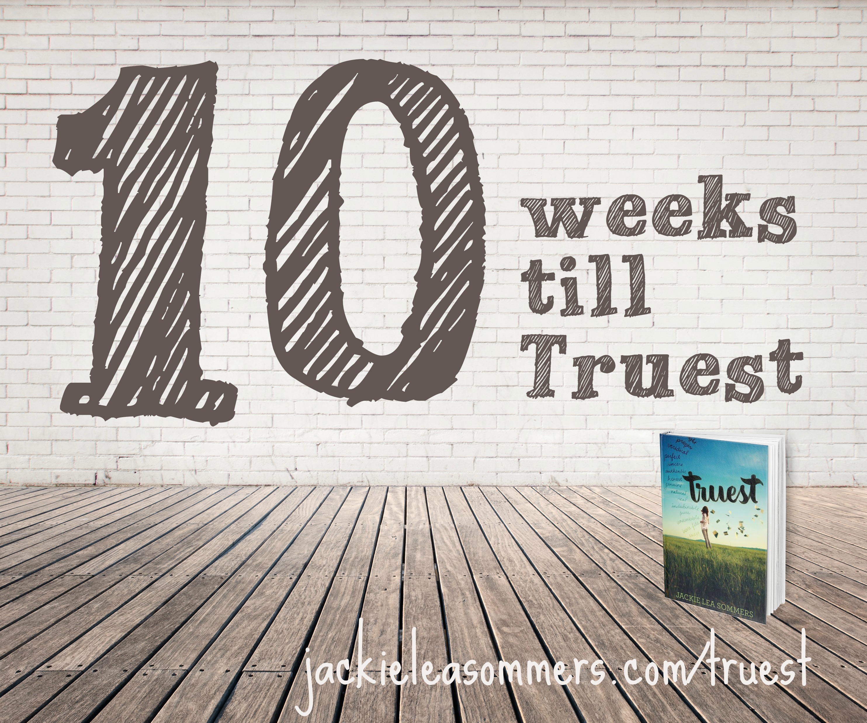
 Join me in counting down the final weeks till Truest’s publication! Every Tuesday, I’ll be posting something Truest-related. Please feel free to re-blog, pin, tweet, share on Facebook, etc.– I’d love to get the word out! And, of course, you can pre-order your own copy here!
Today I’m excited to share with you how Truest‘s book cover came to be. (And please excuse the weird formatting toward the end– once I started inserting pictures, it all went haywire!)
At the end of April 2014, Laurel, an editor at Katherine Tegen Books, sent me this email:
While Jill is still working on gathering notes for you on the latest revision, I have another exciting step in the publication process. We get to start thinking about your cover! Jill and I will fill out a form to share with our designers—who work serious magic and make the best looking books in the industry—but we want your thoughts, too. What sort of design or image do you picture for your cover? Photographic or iconic? Is there anything you absolutely don’t want? Are there other books whose covers you admire? As much info you can give us will help us—and the designers—create the perfect look for TRUEST.
Please feel free to take a few days or even a couple weeks to think about this if you need to and let me know if you have any questions. This is one of my favorite parts of the process so I’m excited to get started!
“Feel free to take a couple of weeks”? The next day, I emailed her:
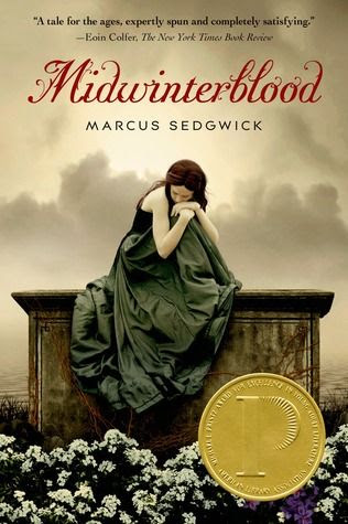
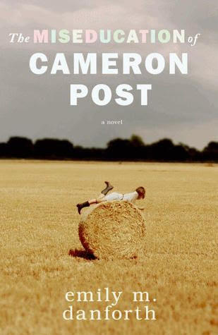
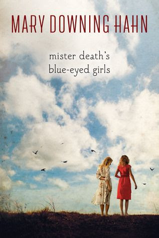
I’m absolutely no designer, but here are my thoughts (in my non-designer language):My DREAM cover:Silas and West, sitting in a lifeguard stand, looking out at the swans on Green LakeAn image like this:I really like the idea of a photographic cover, but I prefer to not see the actual faces (I think it’s better for the reader to imagine the characters than to be shown their faces). I feel like Truest’s cover should have an element of seriousness/depth. I see a lot of books with just a girl on the front, but I’d hope Silas would be there too.I dislike overly girly covers, covers that make it look like the book is ONLY a romance, covers boys would be embarrassed to be holding, covers that insinuate the book is the literary equivalent of a rom com.I also sent along some images of covers I love (most with a darker theme):

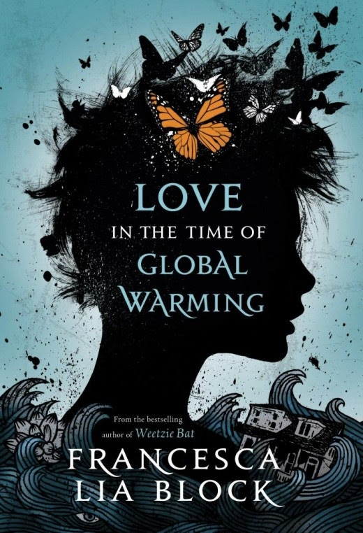
And a couple illustrated covers I love too:


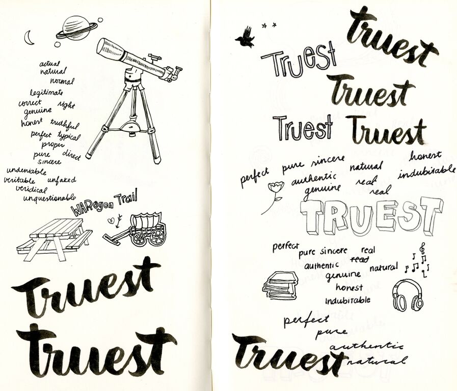
Don’t you love the little tail of hearts??
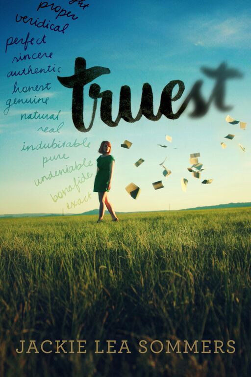
The original of this also had the column of words in dark, bold black.


Reblogged this on write, edit, repeat and commented:
Tuesday is Truestday! Follow Jackie to get some insight on the publishing process. Her debut novel hits shelves in September!
Love the cover! So fun to read about the process!
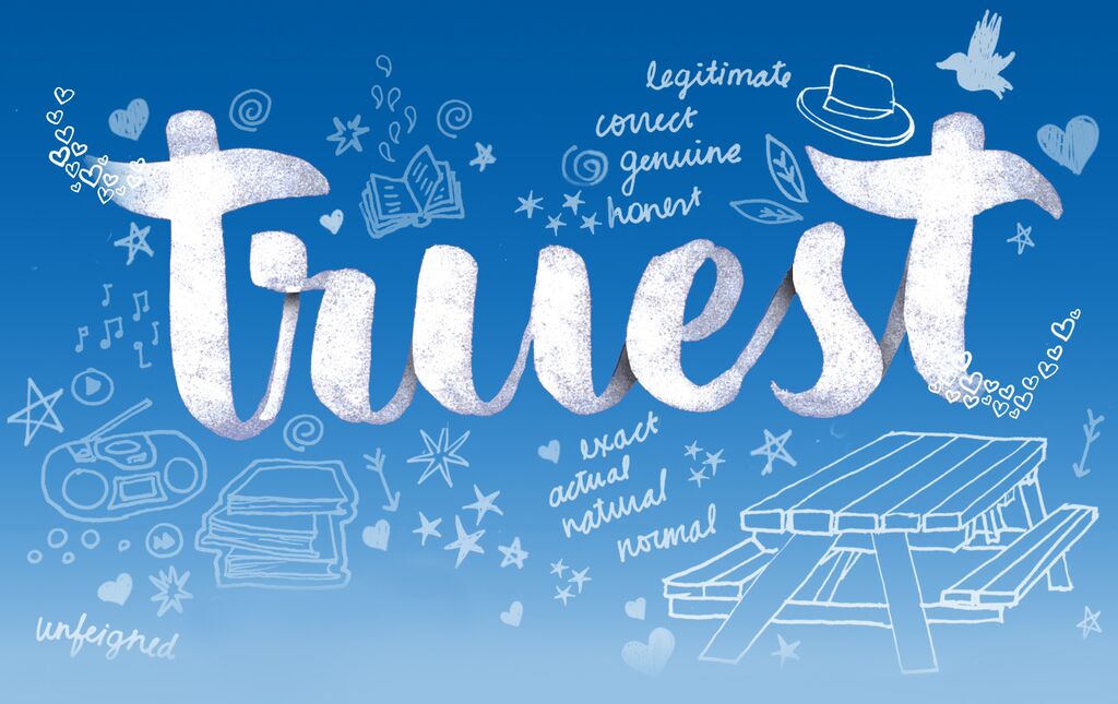
Oh how cool!! I love seeing the progression. I think I love the final version BEST 🙂
Thanks Rachel! I’m soooo happy with how it turned out!! ❤
Pingback: The Little Things
Pingback: Thoughts on Writing: Navigating the Road to Publication | JACKIE LEA SOMMERS